










A paycheck shows what a worker earned in dollars. It does not show what those dollars buy at the grocery counter or the pump. The Bureau of Labor Statistics publishes data on both earnings and consumer prices, and comparing the two shows whether pay is keeping pace with the cost of living.

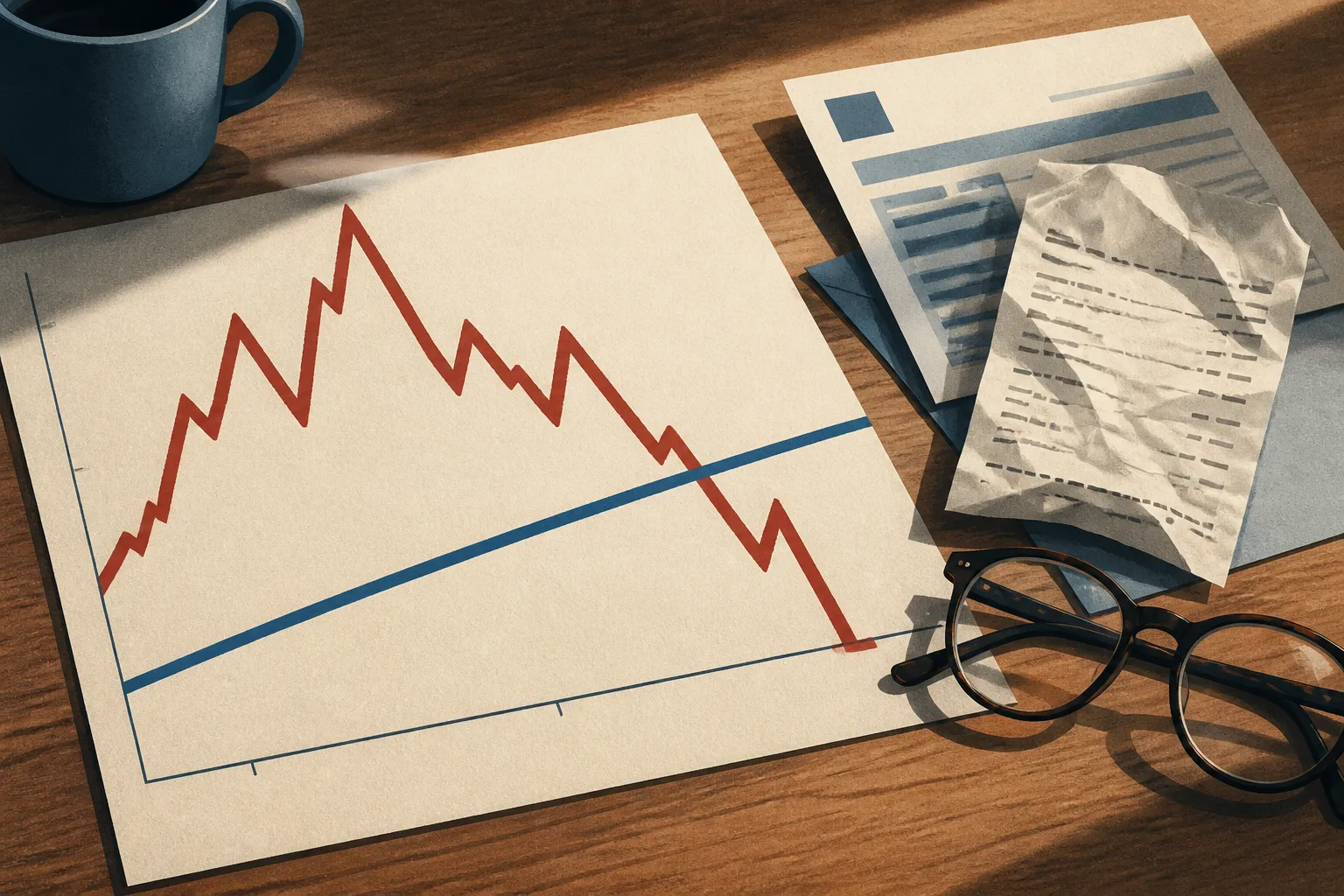
According to The Economics Daily, real average hourly earnings decreased 0.7 percent from September 2025 to September 2026. That is an economy-wide average. The same kind of comparison can be run on a single paycheck, and the examples below show how.
What the 0.7 Percent Figure Means
The BLS headline covers twelve months, from September 2025 to September 2026. Over that span, average hourly earnings adjusted for price changes fell 0.7 percent. In plain terms, an average hour of work bought slightly less at the end of the period than at the start.
The drop sounds small. Consider an illustration, not a BLS figure. On a wage of $30.00 per hour, a 0.7 percent loss in purchasing power is about 21 cents an hour. Over 40 hours, that is roughly $8.40 a week, or about $436 across a year of full-time work.
The figure is an average. The sources reviewed here do not break it down by industry, region or worker group, so some workers likely did better and others worse. We cannot say which from this data.
Real Wages Versus Nominal Wages
A nominal wage is the number on the pay stub. If an employer pays $25.00 an hour, that is the nominal wage. A real wage adjusts that pay for inflation, so it reflects purchasing power. For general background, the St. Louis Fed publishes an explainer on real and nominal wage growth.
The two measures can move in opposite directions. Take an invented example. A worker earning $25.00 an hour gets a 3.0 percent raise, which lifts pay to $25.75. Suppose prices rise 4.0 percent over the same twelve months. Dividing $25.75 by 1.04 gives about $24.76 in starting-period dollars. The worker has 75 cents more in cash and about 24 cents less in buying power.
It works the other way too. With a 4.0 percent raise and 2.5 percent inflation, $25.00 becomes $26.00. Dividing by 1.025 gives about $25.37. Purchasing power rose by nearly 1.5 percent. The raise in dollars looks the same in both cases, but the result depends on what prices did.
How to Calculate Your Own Purchasing Power
You need two pay figures and one price figure. The BLS publishes consumer price data, and its CPI and income fact sheet and Real Earnings release are good general places to start. The steps below are simple arithmetic of our own, not a BLS method.
- Record your current hourly rate and your rate from exactly twelve months earlier.
- Subtract the old wage from the new wage, divide by the old wage, and multiply by 100 to get your nominal raise.
- Find the twelve-month percentage change in a consumer price index for the same dates. Check which index you use, since results can differ.
- Divide one plus your raise by one plus the price change, then subtract one.
A negative result means your buying power fell. Match the dates as closely as you can. Comparing a June raise with September inflation mixes two different periods and can blur the answer.
Why Wage Trends Look Different Depending on the Source
Summaries of pay often disagree. A Brookings analysis from October 2023, now older than much of the data here, said the answer depends on the pay metric, the inflation measure and the start and end dates. Change any one and the picture shifts.
Brookings also reported mixed evidence across wage levels. Lower-income workers saw positive pay changes from before the pandemic to the time of its analysis, while higher-wage workers showed lower or no growth. It listed several forces behind pay since the pandemic: historic job losses at the start, a strong labor market in the recovery, shifts between sectors and high inflation.
Experts disagree: some describe historic gains in workers' pay, while others say pay has fallen since the pandemic began.
That split is why one headline number rarely settles the question.
Why Your Budget May Differ
National statistics are yardsticks, not personal audits. Price indices track an average basket of goods, and household budgets rarely match it. A renter in an expensive city spends more of each paycheck on housing than a homeowner with a fixed-rate mortgage.
Running your own numbers makes the national story concrete. It will not capture every cost you face, but it shows how your pay compared with one chosen measure of price changes over a set period.