









The Consumer Price Index tracks how prices change for the goods and services U.S. households buy. News stories usually give one number. That number blends many separate price streams, and they often do not move together.

What the CPI measures and why it is split
The CPI covers everyday purchases, from food and gasoline to rent and health care. The Federal Reserve Bank of San Francisco publishes a tool that shows how much each category contributes to overall inflation. That is the useful idea here. A total can hide two categories pulling in opposite directions.
Food and energy get charted on their own. Their prices are volatile and react to global supply and demand shocks. A cold snap or an oil disruption can swing them hard, so analysts set them aside when they want a steadier read.
Think of the headline as a weighted average. A category that takes a bigger slice of the typical budget moves the total more. If goods get cheaper while services get pricier, the headline shows only the net result. You cannot tell which side did the work without looking underneath.
How core inflation separates goods from services
Core inflation removes food and energy. What remains includes goods such as cars, furniture and clothing, plus non-energy services such as transportation, education and hospitality. The result is a calmer baseline.
Shelter gets its own slot, apart from other core services. The tool treats it separately because it often moves more slowly. That matters when you read a services number. A big, slow-moving housing component can sit inside it and mask faster changes in things like airfares.
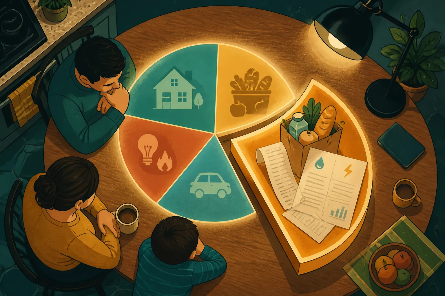
The Fed tool uses four groups: housing, core services excluding housing, core goods, and food and energy. Before you trust any chart, check which of those buckets it shows. A line labeled "services" can mean very different things depending on whether rent is in it.
Reading 12-month changes versus monthly changes
Tables and charts publish two timeframes. In the Fed tool, Figures 1 and 2 show the 12-month change, also called year over year. Figures 3 and 4 show the monthly change. They answer different questions.
The 12-month figure compares prices now with prices a year ago. It smooths out short bursts like a holiday travel surge. The monthly figure compares the latest month with the one before it. It can show a turn sooner, though a single month is a thinner slice of evidence.
A slower monthly pace is not a price drop. Say an index rises 0.5 percent one month and 0.1 percent the next. Prices still went up both times. They simply climbed more gently the second time. Only a negative reading means prices fell.
Subcategories and what the detailed chart shows
Below goods and services sits finer detail. The Fed tool breaks monthly core CPI into 67 subcategories. They include home appliances, used vehicles, rent of primary residence, dental services and airline fares.
Figure 5 ranks those subcategories by how much each adds to monthly core inflation. To keep it readable, it shows only the five largest and five smallest contributors. The ranking changes from month to month, so check the live chart instead of relying on an old screenshot. This piece does not quote current values for that reason.
A practical way to read the table yourself
Start with the monthly BLS release. Open the expenditure category table and look for the rows that separate food and energy from everything else. Find the line that excludes food and energy, which is the core measure, and set it beside the all-items line. If the two differ a lot, food or energy is doing the pushing.
- Pick a timeframe first. Decide whether you want the 12-month change or the monthly one, and do not mix columns.
- Compare headline with core. A wide gap points to food or energy.
- Look for rent or shelter inside services. It can dominate that group.
- Check the sign. A smaller positive number still means higher prices.
Then compare the table with your own budget. Here is a made-up example. A household spends $6,000 a month, with $2,000 on rent and $1,500 on goods. Rent is a third of the budget. A 3 percent rise in rent adds $60 a month. A 1 percent rise in goods adds only $15. Your own inflation rate depends on your mix, not the national average.
The BLS publishes weight information on its relative importance page. Check it for how much of the index each category carries. For the category rows, see Table 1 and the more detailed Table 2. The concepts page is the place to look for how BLS defines goods and services.