









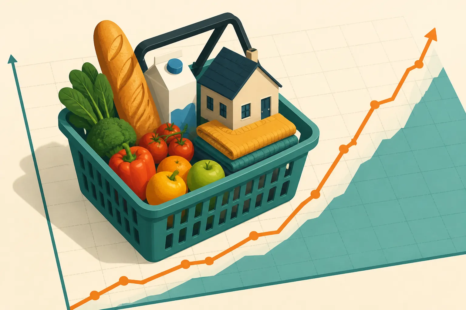
The Consumer Price Index, or CPI, is compiled by the Bureau of Labor Statistics (BLS). It tracks how prices change over time for a basket of goods and services bought by urban consumers. It is often cited as the most common measure of inflation in the U.S. The index does not tell you what a gallon of milk costs. It tells you how fast prices are moving.
The CPI does not tell you what things cost in absolute terms so much as how much prices have moved on average.

The basket is built from expenditure information that families and individuals provide about what they actually buy. Because it is an average, it reflects the spending of a broad population, not any single household. The index also measures percent change from a reference point. The commonly cited CPI-U series uses a 1982-1984 base of 100, according to the St. Louis Fed's FRED page.
Monthly change versus change over 12 months
Most coverage quotes two rates. The monthly rate compares prices to the month before. The 12-month rate compares prices to the same month a year earlier. Percent change from one year ago is the most common inflation figure cited.
A real example shows the gap. In the release dated March 12, 2025, the BLS reported that CPI rose 0.2% from January to February 2025 on a seasonally adjusted basis. Over the previous 12 months it rose 2.8%. Both numbers describe the same index. They answer different questions.
Now compare June 2022. Prices rose 1.3% in that single month and 9.0% over the year. A 1.3% monthly gain is large. A 0.2% gain is modest. Reading the monthly figure first tells you about momentum. Reading the 12-month figure tells you how much has piled up.
A step-by-step read of the release
The sources reviewed here do not walk through the release tables column by column, so check the layout of the current BLS news release yourself. The approach below is a general reading habit, not an official BLS procedure.
- Find the headline sentence at the top. It usually gives the seasonally adjusted monthly change and the 12-month change.
- In the tables, look at the column headings. Confirm which column shows a one-month change and which shows a change from a year ago.
- Check whether a row or table is labeled seasonally adjusted or not seasonally adjusted.
- Scan the category rows, such as food, energy, and shelter, to see what moved the total.
Seasonally adjusted figures remove predictable effects such as weather, the school year, production cycles, and holidays. The unadjusted series reflects all factors that influence prices. Monthly comparisons usually rely on the adjusted numbers. Year-over-year comparisons are often quoted from unadjusted data, so check the label before comparing figures.
Headline CPI versus core CPI
Headline CPI includes everything in the index, including food and energy. Those prices can swing sharply, so the headline number may not always be a reliable signal of inflation or deflation. Core CPI is the version that leaves out food and energy. The FRED page cites core CPI as a more accurate gauge for that reason, though the source does not fully explain how it is calculated.
Category rows show the same effect at a smaller scale. In the February 2025 release, meats, poultry, fish and eggs rose 1.6% in one month and 7.7% over 12 months. That is far above the 0.2% and 2.8% for the whole index. One jumpy category can pull a headline number around without telling you much about everything else.
Weights, coverage, and what the release leaves out
Not every item counts equally. Price changes are averaged using weights that reflect each item's importance in spending. A move in a heavily weighted category such as shelter matters more than the same move in a small one. The BLS publishes a relative importance page for these weights. Housing is measured through a shelter component built from rent data.
Coverage figures differ by source. Penn State's explainer describes about 22,000 retail and service establishments in 75 urban areas, plus rent data from about 50,000 landlords or tenants, covering over 90% of the U.S. population. The FRED page gives different counts and says roughly 88% of the population. Check the BLS release for current figures before quoting either.
The release also has limits. It describes national price movement. It does not tell you how to change a household budget, pay down debt, or plan savings. It also does not compare the CPI with other measures such as the PCE index. Treat it as one indicator among several, and go to the BLS tables when a secondary summary seems off.